

BookMyShow – Interactive Seat Map Redesign
BookMyShow – Interactive Seat Map Redesign
A redesigned mobile booking flow that transforms a static, text-heavy interface into an interactive seat map with clean info cards, making ticket selection faster, clearer, and more engaging.
A redesigned mobile booking flow that transforms a static, text-heavy interface into an interactive seat map with clean info cards, making ticket selection faster, clearer, and more engaging.
Category
event management
Booking
Client
Redesign
Original Design
Original Design

Rating: 7 / 10
Strengths:
Clear seating map: Users can see where each section (GA, VIP, Fan Pit, Lounge) is located relative to the stage. Although the fan pit overlapping the stage can look confusing to users.
Basic explanation of seat categories: Each section includes explanations of benefits like dedicated bars, restrooms, or premium lounges.
Pricing is upfront: Ticket categories and prices are visible immediately below the map in list format.
Weakness:
Cluttered & text-heavy: The long block of text for each ticket tier is overwhelming and reduces quick scanability.
Weak visual hierarchy: The seating map and text colors of the lounge are and the vip look too similar to each other which forces the user to try and mentally match the colors, and could lead to confusion.
No interactivity: Users cannot tap directly on the map to choose a section they must scroll to the pricing list below.
Limited emotional appeal: The layout feels transactional; it doesn’t capture the excitement of attending a concert.
Small font sizes for mobile: The long descriptions require zooming or squinting due to the small font size.
Incomplete Information: The venue for the concert is not fully in the frame cause the user to take additional steps to find out this information.
The Context
The Context
While reviewing the ticket booking interface for Maroon 5’s India 2024 concert, I noticed that the original design was cluttered, text-heavy, and unintuitive. The seat map was static, and users had to scroll separately to understand prices and benefits, making the experience frustrating.
Solution
Solution
Key Points
Interactive Seat Map
Users can tap directly on any section (GA, VIP, Fan Pit, Platinum Lounge).
Immediate connection between where you’ll sit and what you’ll pay.
Clean, Scannable Info Cards
Each section opens a separate card with only relevant details.
No more walls of text – information is broken into icons + short phrases.
Stronger Visual Hierarchy
Clear order: Section name → Price → Benefits → CTA.
Prices are easier to spot and compare across categories.
Color-Coded Consistency
Cards use the same color system as the seating map (Purple = GA, Teal = VIP, Blue = Lounge, Pink = Fan Pit).
Builds instant recognition and reduces cognitive load.
Direct Action with CTAs
“Select Tickets” button available right inside the card.
Shortens the booking flow → users can decide and act faster.
Improved Usability
Mobile-first approach with tap interactions instead of long scrolling.
Easier navigation, especially for first-time users.
Better Experience Design
Feels more intuitive and modern.
Engages the user by making the map itself the starting point instead of an afterthought.

Impact
Impact
Booking flow is now simpler, faster, and more engaging.
Users feel more confident when choosing tickets since prices & perks are tied directly to the seat map.
The redesign turns a static experience into an interactive journey, enhancing both clarity and excitement.
Good design isn’t just about aesthetics – it’s about reducing effort, adding clarity, and creating experiences that feel natural to the user.
More projects

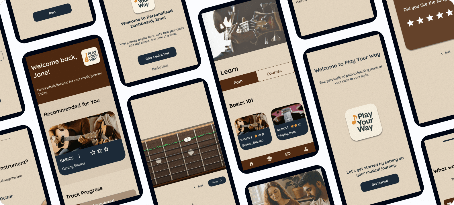
Play Your Way – A Personalized Music Learning Experience (Case Study)
An AI-powered, gamified platform that supports self-taught musicians with structure, feedback, and motivation — helping them learn their instrument, their way.
Client
Case Study
Play Your Way – A Personalized Music Learning Experience (Case Study)
An AI-powered, gamified platform that supports self-taught musicians with structure, feedback, and motivation — helping them learn their instrument, their way.
Client
Case Study
Play Your Way – A Personalized Music Learning Experience (Case Study)
An AI-powered, gamified platform that supports self-taught musicians with structure, feedback, and motivation — helping them learn their instrument, their way.
Client
Case Study

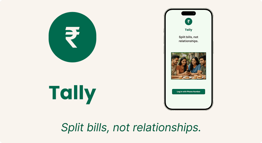
Tally - End to End Application Case Study
Tally is a UPI-first bill-splitting app designed for young Indian users. It simplifies group expenses with equal/unequal splits, bill scanning, and seamless in-app payments.
Client
Case Study
Tally - End to End Application Case Study
Tally is a UPI-first bill-splitting app designed for young Indian users. It simplifies group expenses with equal/unequal splits, bill scanning, and seamless in-app payments.
Client
Case Study
Tally - End to End Application Case Study
Tally is a UPI-first bill-splitting app designed for young Indian users. It simplifies group expenses with equal/unequal splits, bill scanning, and seamless in-app payments.
Client
Case Study