
Tally - End to End Application Case Study
Tally - End to End Application Case Study
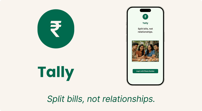
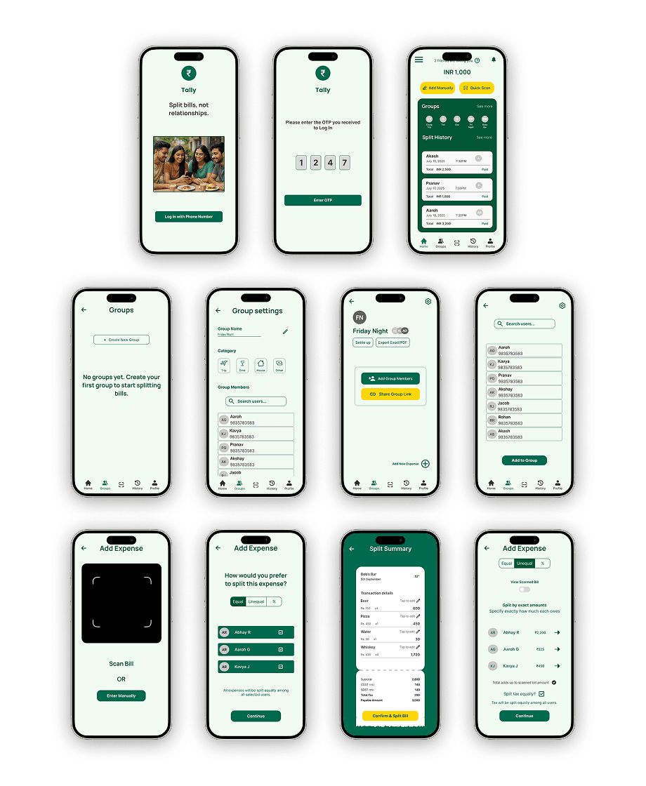
Tally is a UPI-first bill-splitting app designed for young Indian users. It simplifies group expenses with equal/unequal splits, bill scanning, and seamless in-app payments.
Tally is a UPI-first bill-splitting app designed for young Indian users. It simplifies group expenses with equal/unequal splits, bill scanning, and seamless in-app payments.
Category
Landing Page
Client
Case Study
The Challenge
The Challenge
How might we design a solution that makes splitting bills simple, fair, and stress-free, while also integrating with India’s preferred payment methods? Users need more clarity in error handling, flexibility in splitting, and a faster way to settle dues.
Goal: Design a mobile-first solution that makes splitting bills simple, transparent, and UPI-first, while reducing social awkwardness.
Research & Insights
Research & Insights
Methods: User interviews, Competitive Analysis and Affinity Mapping
Surveyed & interviewed 5 participants (students, professionals, social spenders).
Built User Personas reflecting different needs (simplicity, transparency, trust).
Key Pain Points:
Awkwardness in reminding friends.
Confusion in itemized/unequal splits.
Switching apps for payments.
Lack of clarity when errors occur.
Key Takeaways
Users want seamless group creation without extra steps.
Error handling must be clearer and action-driven.
Direct UPI integration is a must-have differentiator.
Transparency (seeing the bill, who owes what, and how it’s calculated) builds trust.
Design Process
Design Process
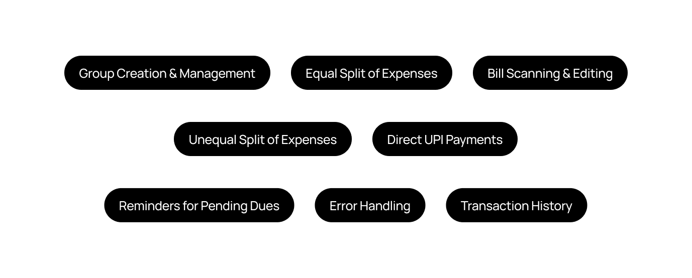
Feature Prioritization
Feature Prioritization
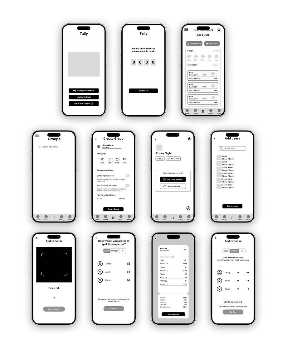
Wireframes & Iterations
Wireframes & Iterations
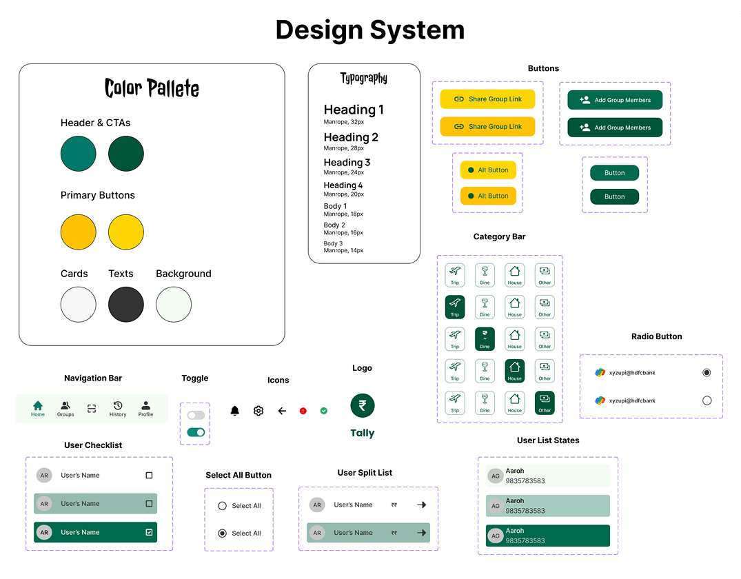
Branding
Branding
The brand choices communicate trust, simplicity, and friendliness, with a modern, approachable tone. Core UI elements such as buttons, navigation bars, toggles, and checklist states were designed as reusable components, making it easier to scale the product while keeping the experience cohesive.
The brand choices communicate trust, simplicity, and friendliness, with a modern, approachable tone. Core UI elements such as buttons, navigation bars, toggles, and checklist states were designed as reusable components, making it easier to scale the product while keeping the experience cohesive.
Reflection
Reflection
Working on Tally taught me the importance of designing for context-specific needs. In India, UPI integration isn’t just a nice-to-have feature, it’s a necessity that drives adoption and trust. I also learned how small UX decisions—like clearer error alerts, auto-selecting members in equal splits, and placing confirmation messages at the right stage—can make a significant difference in user confidence and satisfaction. Conducting usability testing early, even with low-fidelity wireframes, proved invaluable for uncovering pain points that shaped the final product.
Looking ahead, I see opportunities to expand Tally with features like recurring expense tracking, spending analytics, and dark mode for accessibility. A real-world pilot with small friend groups would also help validate adoption and provide insights for further refinement.
More projects

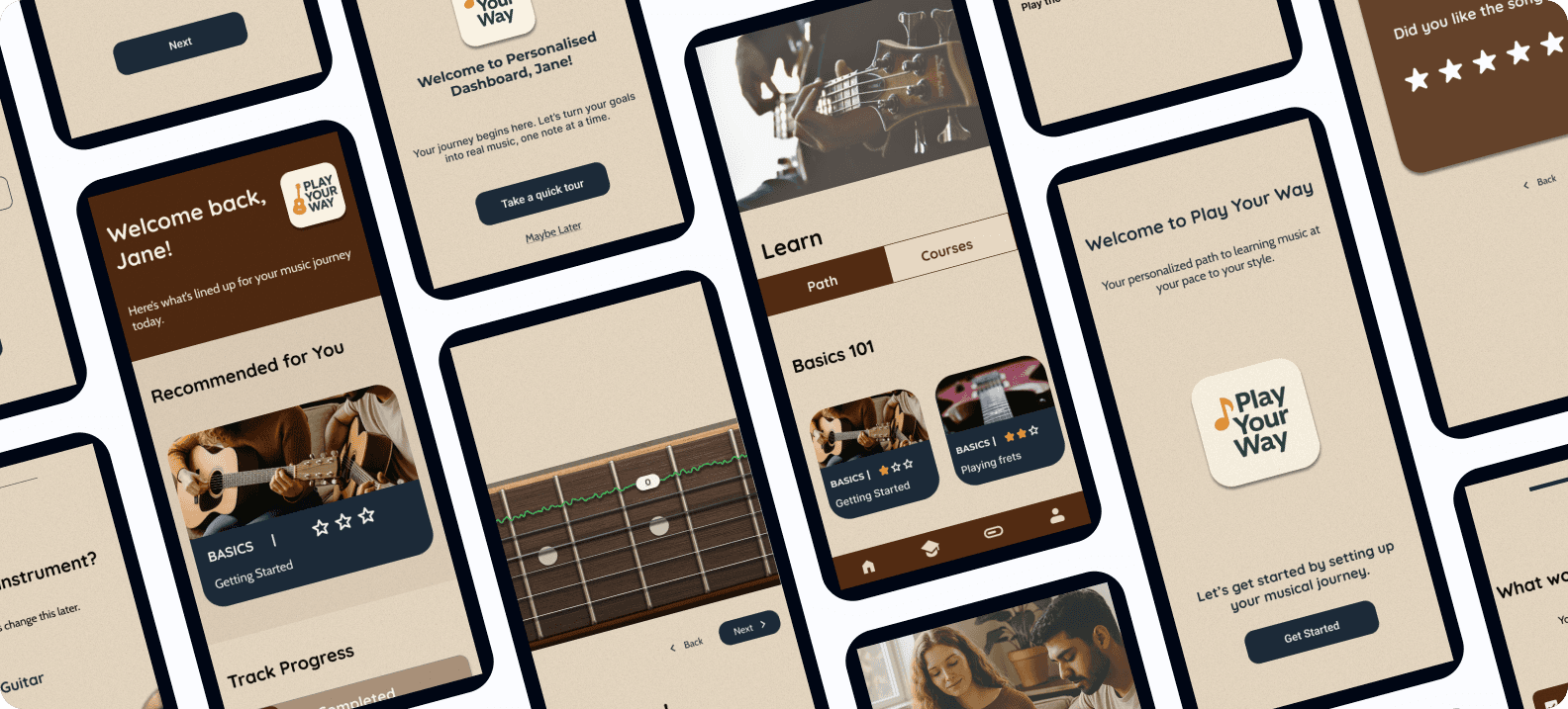
Play Your Way – A Personalized Music Learning Experience (Case Study)
An AI-powered, gamified platform that supports self-taught musicians with structure, feedback, and motivation — helping them learn their instrument, their way.
Client
Case Study
Play Your Way – A Personalized Music Learning Experience (Case Study)
An AI-powered, gamified platform that supports self-taught musicians with structure, feedback, and motivation — helping them learn their instrument, their way.
Client
Case Study
Play Your Way – A Personalized Music Learning Experience (Case Study)
An AI-powered, gamified platform that supports self-taught musicians with structure, feedback, and motivation — helping them learn their instrument, their way.
Client
Case Study

Netflix Watch Party Feature (Case Study)
I designed a native Netflix Watch Party feature to make group viewing simple, seamless, and social, eliminating the need for third-party tools. The solution focuses on intuitive onboarding, real-time interaction, and smart content recommendations to enhance shared entertainment experiences.
Client
Case Study