
Transforming SciQuiry: Designing an Adaptive and Intuitive EdTech Experience
Transforming SciQuiry: Designing an Adaptive and Intuitive EdTech Experience
Client-based Live Project
Client-based Live Project
Category
EduTech
Client
Sciquiry
SciQuiry is a science learning platform that helps K–8 students master science through adaptive, Duolingo-style question sequences while providing teachers with real-time insights into student performance. The objective of this project was to redesign SciQuiry’s digital experience to better communicate its value proposition, improve teacher and student onboarding, and establish greater trust and credibility through clear information architecture and visual hierarchy.
SciQuiry is a science learning platform that helps K–8 students master science through adaptive, Duolingo-style question sequences while providing teachers with real-time insights into student performance. The objective of this project was to redesign SciQuiry’s digital experience to better communicate its value proposition, improve teacher and student onboarding, and establish greater trust and credibility through clear information architecture and visual hierarchy.
The Challenge
The Challenge
SciQuiry’s existing website didn’t clearly communicate its value to teachers or students. The experience felt fragmented, with unclear messaging, limited visual proof, and a confusing onboarding flow. Teachers found it hard to understand how SciQuiry fit into their classroom, and students lacked a simple entry point.
The goal was to redesign SciQuiry’s digital experience to improve clarity, trust, and usability through:
A unified, role-based onboarding flow for teachers and students.
Clear value communication for educators evaluating the platform.
Transparent pricing and improved information hierarchy
Research & Insights
Research & Insights
To understand SciQuiry’s users and identify pain points, I conducted a competitor analysis, user surveys, and affinity mapping. The research focused on how K–8 teachers, parents, and students interacted with digital learning tools.
Research Methods: Competitor Analysis, User Surveys, Affinity Mapping and Usability Testing.
Key Insights:
Teachers wanted transparent pricing and clear demonstrations of classroom value.
Students needed simplified onboarding and instant feedback to stay engaged.
Both groups valued visual clarity and consistency across pages.
The homepage lacked a clear, unified value proposition for educators.
Design Process
Design Process
Based on research insights, our strategy focused on creating a clear, trustworthy, and role-based experience that addressed the needs of both teachers and students. The approach emphasized three main goals:
Clarity: Simplify information architecture and clearly communicate SciQuiry’s value proposition for teachers evaluating the platform.
Personalization: Introduce separate onboarding paths for teachers and students, beginning with a unified welcome screen.
Credibility: Build trust through transparent pricing, proof of value, and consistent visual hierarchy.
To achieve this, we restructured the website into five key pages - Homepage, For Teachers, Features, Pricing, and About Us.
Each page was designed to guide users logically through discovery, evaluation, and sign-up while maintaining a consistent tone and visual system.
Wireframes & Iterations
Wireframes & Iterations


We began by creating low- and mid-fidelity wireframes to establish layout, hierarchy, and content flow across five key pages — Homepage, For Teachers, Features, Pricing, and About. The goal at this stage was to define clear navigation, reduce visual clutter, and ensure each page communicated its purpose effectively.
A major design improvement was the introduction of a role-based onboarding experience.
The Welcome Page users identify as a teacher or student, personalizing the flow from the start.
The Teacher Path guides users through account creation and school details.
The Student Path uses class codes to make joining a class seamless and fast.
This structure reduced cognitive load and created a more relevant experience for each user group.
Design System
Design System
We developed a modern, adaptive design system with consistent color usage, typography, and component styles.
We developed a modern, adaptive design system with consistent color usage, typography, and component styles.

Branding

Mockups
Mockups
The redesigned SciQuiry experience delivers a cohesive, trustworthy, and user-centered platform for K–8 educators and students.
The final design emphasizes clarity, role-based personalization, and transparency, ensuring both teachers and students can easily understand, adopt, and engage with the platform.


Reflection
Reflection
The redesigned SciQuiry experience now provides a seamless and trustworthy journey for educators and students — improving usability, clarity, and adoption across the platform.
Through research, testing, and iterative design, the project demonstrates the impact of user-centered thinking in shaping meaningful educational technology experiences.
Key Learnings
Designing for multiple audiences (teachers, students, parents) requires clear segmentation and contextual messaging.
Even small details — like adding a demo video or follow-up CTA — can significantly improve user confidence and engagement.
Maintaining consistency in tone, layout, and content hierarchy helps build long-term trust in educational platforms.
Collaboration and iterative testing were crucial in refining the experience and aligning user needs with business goals.
More projects

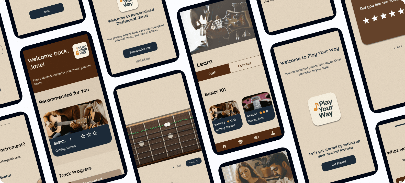
Play Your Way – A Personalized Music Learning Experience (Case Study)
An AI-powered, gamified platform that supports self-taught musicians with structure, feedback, and motivation — helping them learn their instrument, their way.
Client
Case Study
Play Your Way – A Personalized Music Learning Experience (Case Study)
An AI-powered, gamified platform that supports self-taught musicians with structure, feedback, and motivation — helping them learn their instrument, their way.
Client
Case Study
Play Your Way – A Personalized Music Learning Experience (Case Study)
An AI-powered, gamified platform that supports self-taught musicians with structure, feedback, and motivation — helping them learn their instrument, their way.
Client
Case Study

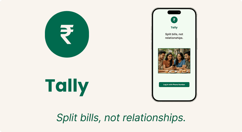
Tally - End to End Application Case Study
Tally is a UPI-first bill-splitting app designed for young Indian users. It simplifies group expenses with equal/unequal splits, bill scanning, and seamless in-app payments.
Client
Case Study
Tally - End to End Application Case Study
Tally is a UPI-first bill-splitting app designed for young Indian users. It simplifies group expenses with equal/unequal splits, bill scanning, and seamless in-app payments.
Client
Case Study
Tally - End to End Application Case Study
Tally is a UPI-first bill-splitting app designed for young Indian users. It simplifies group expenses with equal/unequal splits, bill scanning, and seamless in-app payments.
Client
Case Study